


Eurotypo
Fractus
DESIGNED BY
Olcar Alcaide
YEAR OF ISSUE
2019


The Evolution of Gothic Letterforms
Medieval scribes—the devoted keepers of knowledge within monasteries—worked with one essential priority: to conserve every inch of their precious writing surfaces. From this need emerged the evolution of Gothic letterforms, a centuries-long journey that gave birth to a rich variety of blackletter styles. Among the most notable are Textura—also known as “Gothic Antique”—and Rotunda, a softer, more rounded script favored by Italian and Spanish scribes.
The Rise of German Fraktur
Around 1490, the French Bâtarde style began to spread across Germany, soon becoming known as Schwabacher, distinguished by its warm, rounded shapes. Shortly thereafter came Fraktur, a narrower and more condensed evolution attributed to Johann Neudörfer of Nuremberg (1513). Its popularity was immediate—so much so that within just a few years it evolved into a graphic emblem of German national identity for nearly four centuries.
A Fusion of Rigor & Baroque Elegance
Fraktur can be seen as a refined fusion of Textura and Schwabacher. Its lowercase letters balance strict vertical strokes with carefully placed curves, while its uppercase characters carry the expressive influence of the Baroque, adorned with dynamic flourishes that suggest motion and elegance.
A Timeless Choice for Commanding Branding
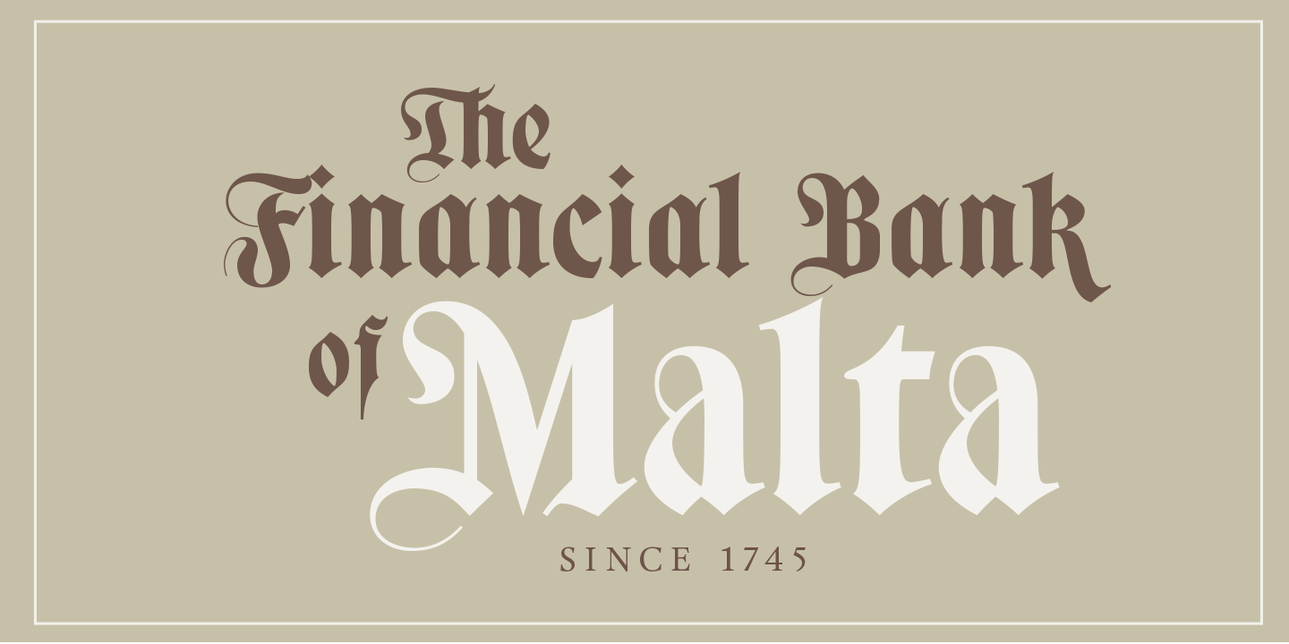
Despite the passing of centuries—and despite not being suited for long-form reading—Gothic Fraktur has retained an undeniable allure. Its strong, commanding presence and its deep connection to the spirit of Northern Europe’s Gothic cathedrals have allowed it to endure across time and trends. Today, its expressive power continues to make it a favorite across a remarkably wide range of applications: from banks, insurance companies, law firms, publishers, newspapers, and TV networks, to alcoholic beverages, tombstones, packaging, and even tattoos. Fraktur remains the go-to choice when the message must convey strength, tradition, and unmistakable character.
Font Sampler
-
Fractus Regular


Glyph Map
Name: -
Unicode: -
Index: -
Technical Specifications
Simple Licensing
One-time payment. Perpetual use. No subscription fees.
Standard
Freelancers & Individual Creators- 1 User (Workstation)
- Basic Web (100k views / mo)
- Logos, Print & Social Media
Studio
Small Agencies & Teams- Up to 10 Users
- 1 Million Web views / mo
- Paid Digital Ads (YouTube/Social Media)
- 1 App or eBook Included
Corporate
Large Organizations- Unlimited Users & Web
- Unlimited App Embedding
- TV, Cinema & Netflix Rights
- Internal Server Installation